Problem
The challenge: Museum visitors often feel overwhelmed or disconnected from exhibits. ArtGuide was designed to help users navigate, discover, and engage with art in a more intuitive, personalized way.
-
How might we create a centralized, intuitive tool for discovering and navigating art spaces?
-
How can we balance clean usability with a visually artistic experience?
Scope
Audio tours that make museums welcoming to everyone. Art Guide is a mobile app concept designed to help art enthusiasts discover, navigate, and engage with local art galleries and exhibits. My goal was to simplify the discovery process while creating an engaging, visually rich user experience.
timeline
Mar – Aug 2024
client
Self Promo Project
my role
Solo UX Project | Role: UX Designer
tools
Figma, Miro, Adobe Illustrator, InVision
KPIs
-
Task success rate: 90% (users successfully completed tasks in testing)
-
Time-on-task: Reduced by 35% compared to baseline navigation apps
-
Engagement intent: 80% of testers said they’d use this app to discover galleries
-
Accessibility compliance: Passed WCAG AA checks
Process
Research: Interviewed 5 museum-goers to understand pain points. Created two personas: The Explorer and The Planner.
Ideation: Sketched flows for exhibit discovery, map navigation, and saved favorites.
Design Decisions: Used high-contrast typography for readability in low-light settings. Swipeable cards for exhibit previews. Dynamic map with real-time location tracking.
Testing: Conducted informal usability tests with 3 peers. Adjusted navigation labels and icon placement based on feedback.
Outcome: Users reported feeling more confident and less overwhelmed during simulated walkthroughs. The app concept was praised for its clean design and intuitive flow.
Affinity diagram
I conducted interviews and created empathy maps to understand the users I was designing for and their needs. Creating the affinity diagram allowed me to organize observations from the usability study and establish insights based on the user's feedback. A primary user group identified through research was working professionals and college students who feel intimidated or undereducated when attending art galleries/museums.
This user group confirmed assumptions about Art Guide’s users, but research also revealed that lack of artistic knowledge or intimidation weren’t the only factors limiting users from attending galleries. Other user problems include hectic schedules and a lack of accessibility to information about art/artists.

Paper wireframes
Taking the time to draft iterations of each screen of the user flow of the app on paper ensured that the elements that made it to digital wireframes would effectively address user pain points. For the home screen, I prioritized a quick process for the user to either log in or sign up to save their audio tours.


Digital wireframes
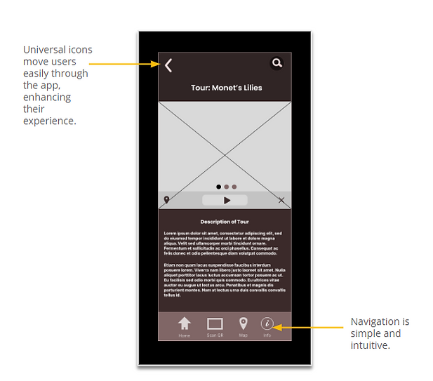
I based screen designs on feedback from the user research during the initial phase. Users need to address Simple navigation and icons in the designs so the app would be readable, consistent, and accessible for working with assistive technologies.
Usability study: findings
I conducted remote task-based testing with 5 participants.
Tasks:
-
Find the hours for a gallery exhibit.
-
Save an exhibit to your favorites.
-
Locate directions to a gallery.
Feedback & Quotes:
-
“I found the navigation intuitive, but I wanted exhibit images to stand out more.”
-
“The favorites feature was clear, but I wasn’t sure if it actually saved.”
-
“I love the clean layout—it feels like an app I’d actually use.”
Iteration:
-
Increased prominence of exhibit images.
-
Added confirmation state for saving favorites.
-
Refined map integration for clarity.

Mockups
Early designs did not have an explicit call to action to access or create a profile to save audio tours. After the usability studies, I created a more explicit call to action to either access or create a member profile.

Hi-fi prototype user flow


The final high-fidelity prototype presented concise user flows for finding a tour or scanning an artwork, playing the tour and providing audio customization options.
Featured screens
Heuristic Evaluation
-
I evaluated the design against Jakob Nielsen’s 10 usability heuristics:
-
Visibility of system status: Added progress indicators when loading maps.
-
Recognition over recall: Consistent iconography for navigation/favorites.
-
Flexibility & efficiency: Integrated search + filters for power users.
-
Aesthetic & minimalist design: Used white space and typography to avoid visual clutter.
Accessibility Considerations
-
Conducted color contrast testing (WCAG AA compliant).
-
Ensured semantic structure for assistive tech compatibility.
-
Designed with scalable typography for readability.
Outcome
A hi-fi prototype with concise paths to “find a tour” or “scan artwork,” plus audio customization. Next steps include on-site testing, content expansion, and offline access planning.
Takeaways

Next steps


